This article has been reviewed according to Science X's editorial process and policies. Editors have highlighted the following attributes while ensuring the content's credibility:
fact-checked
peer-reviewed publication
trusted source
proofread
Ensuring effective visual communication of climate change

The consequences of a warming climate frequently dominated the news this summer, from devastating wildfires and floods to deadly heat waves across the globe. Reducing harm from climate change is a challenging endeavor, and it requires comprehensive public education. Thus, the question arises: How can climate change science be made most accessible to the general population, as well as decision-makers and educators?
In a new paper published in the journal Geosphere, Steph Courtney and Karen McNeal explore the effects of improved data visualizations on user perception of climate change evidence.
With a geoscience background and a specialization in science education and communication, Courtney is passionate about improving the public's understanding of climate change. "We get excited and carried away as scientists but that's not going to work for a lot of audiences," says Courtney. "Your communication goal is more important than how cool you think your graph is."
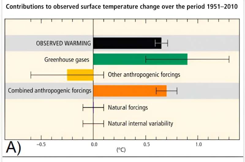
In this study, the team redesigned three graphs from the Intergovernmental Panel on Climate Change (IPCC) Fifth Assessment Report. They assessed the impact of the redesign on graph usability (i.e. individuals' ability to accurately and quickly extract information from it) and user perception of scientist trustworthiness and climate change risk, which correlate to both knowledge and intention to take action.
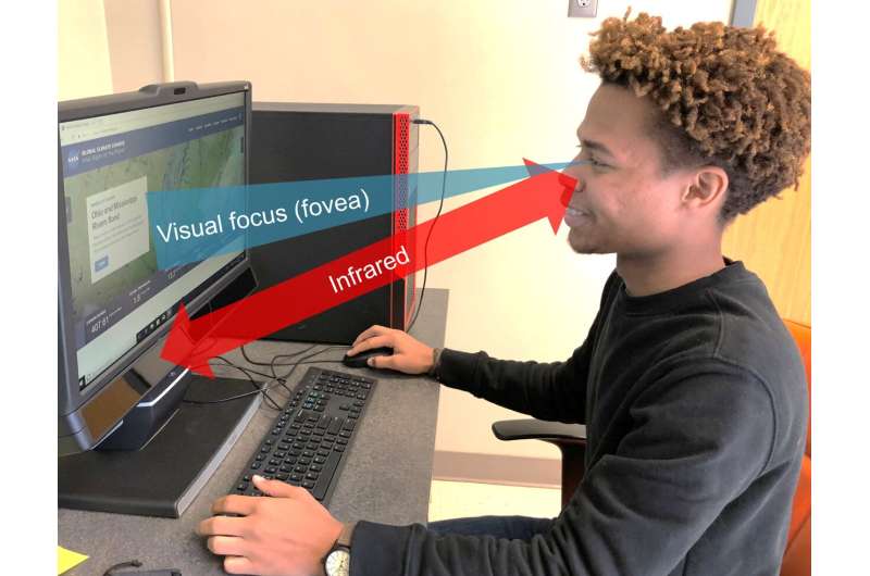
The process was iterative, including two rounds of user testing and successive redesign and re-testing. Methods included a combination of surveys, eye-tracking, ranking activities, and interviews.

While the overall usability of the redesigned charts was found to be equivalent to that of the originals, study participants perceived all of the redesigned figures to be more trustworthy. Participants also reported one of the redesigns made them more concerned about climate change than the original.
An interesting question explored in this study was whether more simplistic figures would look "less scientific" and thus less trustworthy. Surprisingly, this did not turn out to be the case. "Pretty is fine," explains Courtney. "If it looks nicer, it looks like you put time into it, so you care about it and you know what you are doing. Understandable and attractive graphs can be trustworthy. It is a win-win."
The authors found that familiar figure formats were most useful; even minor changes to standard charts were confusing to the audience. Intentional use of color-coding was very important to participants, increasing both their understanding and perception of credibility. Likewise, minimal use of additional explanatory text on axes and fields greatly helped in those respects, although visual cluttering is a potential downside.
Graph redesign in this study was subtle, in order to be able to confidently parse out which change resulted in what improvement. Yet some of these changes were quite impactful. "Little changes that take just a bit of effort can make the science more accessible and meaningful to people. It is worth that little bit of effort. Communication is not the only barrier in addressing climate change, but it is an area we can stand to improve—and it is worthwhile," emphasizes Courtney.
Courtney sees the future of this research field focusing on practical examples of climate scientists' top priorities for public understanding of and actions to address climate change, perhaps attempting more dramatic graph edits. She will share her results with the IPCC and is looking forward to seeing their next assessment report.
More information: Steph L. Courtney et al, Seeing is believing: Climate change graph design and user judgments of credibility, usability, and risk, Geosphere (2023). DOI: 10.1130/GES02517.1
Journal information: GeoSphere
Provided by Geological Society of America


