Researchers show Starbucks' logo redesign could prove beneficial to company
Despite U.S. consumers' threats of protests in response to the redesigned Starbucks logo unveiled yesterday, the new look may be a smart move in the long run as the coffee company expands into Asian markets, according to a Rice University researcher who has studied consumer reaction to logos.
"The logo of a brand is much more than a pictorial representation of the brand," said Rice Professor of Marketing Vikas Mittal, who has co-authored two studies on customers, logos and brand commitment. "For consumers who are highly committed to the brand, the logo represents a visual conduit that enables a customer to identify with the brand. Our studies have shown that highly committed consumers also have very high levels of brand attachment. As such, any changes to the brand conduit -- the logo -- are seen as a violation of the psychological contract between the brand and the consumer."
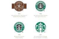
Starbucks dropped both its name and the word "coffee" from its 40-year-old logo as the Seattle-based coffee chain prepares to triple its locations in China from about 400 to 1,500.
In one of his studies, Mittal found that companies that changed their logo design were most likely to estrange their most committed customers. A second study found that when angular logos were changed to rounded logos, they were more acceptable in interdependent and collectivist cultures -- often found in Asian countries, such as India and China -- than in Western countries, which tend to have a more independent or individualistic culture.
Mittal and his co-authors on both studies, Michael Walsh of West Virginia University and Karen Winterich of Penn State University, found that the higher the consumer's commitment to the brand, the more negative the consumer's reaction to any changes in the logo design. A logo change elicited three times more negative thoughts among strongly committed consumers than among consumers with weak commitment to the brand.
The study showed that after a change in the logo, strongly committed consumers held a more negative attitude of the brand than consumers who had low brand commitment.
"It is important for companies to refresh their logos, but the process of doing so must be carefully managed," Mittal said. "Our research shows that companies need to carefully consult customers -- whether through Internet sites or chat rooms -- to ensure that customers feel they have been heard in the redesign and repositioning process. That will ensure that highly committed customers -- who are also often the heaviest consumers of the brand -- feel connected to the brand."
Mittal said that though Starbucks seems to have alienated some of its loyal U.S. customers -- some customers have planned protests -- the redesign will likely generate more brand loyalty among new customers in countries such as China, India, Taiwan and Singapore, all of which are strong emerging markets and have consumers who tend to be culturally collectivist and interdependent. Mittal said that removing the lettering gives the logo a more rounded appearance.
The second study compared two groups of customers: In one group they experimentally evoked an interdependent/collectivist mindset and in the other the researchers evoked an individualistic/independent mindset. The study participants were then shown a rounded logo or an angular logo and asked to rate how much they liked the brand on a seven-point scale. Results showed that changing the logo to be rounded led to a more positive brand attitude among highly committed customers with an interdependent mindset (5.9). In contrast, changing the logo to be rounded was negatively perceived by committed customers with an independent mindset (5.0). Interestingly, in both groups, the weakly committed customers had high brand attitude (5.6 or more).
"Research in aesthetics shows that interdependent cultures prefer rounded shapes as they represent harmony, which is consistent with an interdependent view of the world," Mittal said. "Those countries tend to have a higher percentage of rounded logos compared with individualistic countries, and logos and product shapes that are rounded are more acceptable and embraced in those cultures."
Provided by Rice University


