Research finds that difficult-to-read fonts can positively affect buying habits
Imagine looking at some advertisements for cell phones. One features a highly stylized font that is difficult to read; the other appears in an easy-to-read font. How would you respond to the different promotional offers? That is, does the font used by marketers to convey a price promotion affect your perception of the product and purchase behavior?
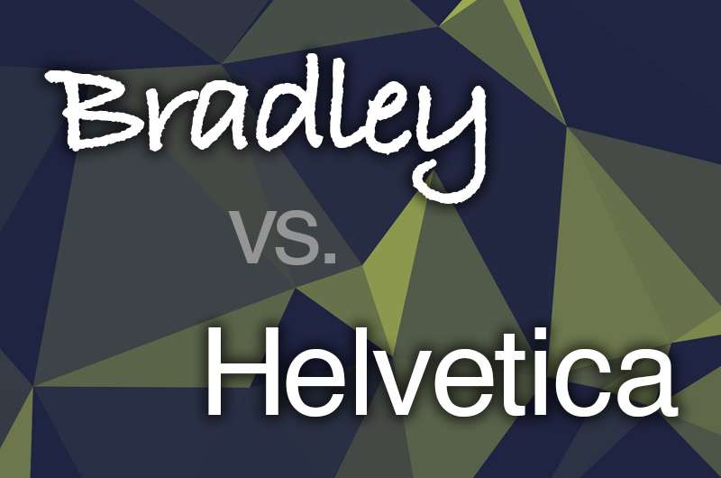
It's widely accepted that fluent fonts, such as Helvetica, are easy to process and the processing they facilitate should create a positive effect that consumers generally misattribute to the quality of the related object. As a result, many companies including Target, Mattel, Staples and The North Face use Helvetica in their brand logos. Helvetica was also used in the posters for the television show Mad Med. From this, one could assume that when fonts are easier to read, they are more liked by consumers and therefore increase their purchases.
In a new paper, forthcoming in the Journal of the Academy of Marketing Science, a team of researchers including Drexel University's Rajneesh Suri, PhD, a professor of marketing at the LeBow College of Business, take a closer look at how consumers' buying decisions are influenced by fonts. They argue that when product and price information appears in disfluent fonts—those are more difficult to read such as the Bradley font—customers take more time to read and process the information, which should induce greater recall of that information and may lead to a perception that the product in question is a better value for their money.
"Simply stated, we suggest that marketers might think that simplifying a consumer promotion might help increase sale. However we show that, in fact, a harder-to-read font makes them more likely to purchase a product—hence the paradox," said Suri.
The researchers found that if a marketer wants consumers to notice the value communicated by a lower price, a disfluent font might be beneficial and more effective. Even though consumers say they don't prefer difficult-to-read fonts or advertisements, the research shows they are actually more likely to purchase the related promoted offers.
The study also notes that when offers are monetarily similar consumers prefer fluent fonts. However, even though consumers find prices in fluent fonts easier to grasp, prices promoted in harder-to-read fonts increase sales. These effects depend on the successful processing of disfluent fonts. Thus people who process information more deeply are more likely to experience the benefits of disfluency. They're more likely to understand the promotion even though it's written in a disfluent font and benefit from buying the discounted product.
More information: Scott Motyka et al. Disfluent vs. fluent price offers: paradoxical role of processing disfluency, Journal of the Academy of Marketing Science (2015). DOI: 10.1007/s11747-015-0459-0
Journal information: Journal of the Academy of Marketing Science
Provided by Drexel University


