This article has been reviewed according to Science X's editorial process and policies. Editors have highlighted the following attributes while ensuring the content's credibility:
fact-checked
trusted source
proofread
WhaleVis turns more than a century of whaling data into an interactive map

Even though they're the largest animals on earth, whales remain difficult to track. So experts often turn to historical whaling data to inform current research. A dataset maintained by the International Whaling Commission (IWC) contains detailed information on commercial whale catches—more than 2.1 million records, predominantly from 1880 until the IWC banned whaling in 1986. Yet for researchers, distilling that data can prove its own challenge.
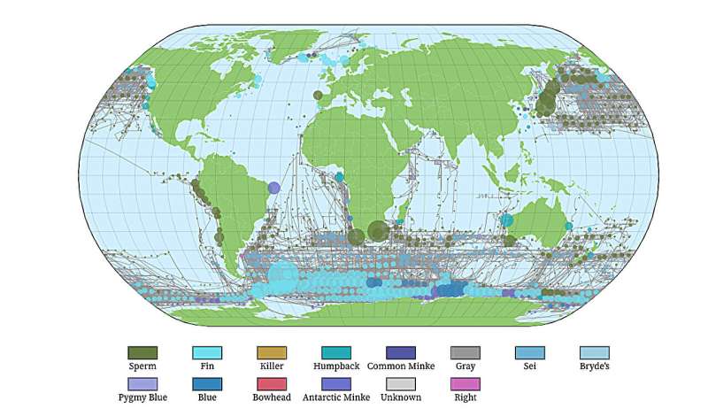
A team at the University of Washington has created an online interactive map called WhaleVis, which lets whale researchers visualize the IWC's data on global whale catches and whaling routes. From this, researchers can estimate the animals' spatial distribution and the effort whalers put into hunts.
By comparing historical data and its trends with current information, scientists can better understand how populations of whales have changed over time, where they've been, and how to better protect those still living.
The UW team presented its research Oct. 25 at the IEEE VIS conference in Melbourne (Narrm), Australia. The tool is online, but users must have permission from the IWC to access it.
"Scientific data is a really important aspect of big data, but scientists all over the world have access to completely different hardware and software. Maybe they can't use big servers to process huge data sets quickly," said senior author Leilani Battle, a UW assistant professor in the Paul G. Allen School of Computer Science & Engineering. "So when creating WhaleVis we had to ask: How do we design a tool that can visualize millions of data points, but that doesn't rely on super beefy servers?"
The team approached this in a couple of ways. First, instead of trying to render more than 2 million points on a global map at once, taxing the computer processor and creating a "hairball visualization"—an illegible mess of lines and dots—the researchers aggregated whale catches in clusters. One large blue dot at South Georgia island in the South Atlantic Ocean, for example, signifies 130,611 whale catches, most of them fin whales. As researchers continue to develop the tool, they'll allow users to zoom in on parts of the map to access greater detail.
Second, they built the tool for web browsers, instead of as a standalone app, to make it function on different computing platforms.
"It was important to make this data accessible so it can easily be used to generate actionable insights," said lead author Ameya Patil, a UW doctoral student in the Allen School. "Tools like this make information more tangible and comprehensible."
WhaleVis came about through the UW's Computing for the Environment, an initiative bringing together computer and climate scientists to collaborate. Trevor Branch, a co-author on the paper and UW professor in the School of Aquatic and Fishery Sciences, had been working with the IWC data set and wanted help visualizing it, especially in such a way that would estimate how much effort had gone into each whale catch. Battle and Patil were seeking a project that combined environmental science with data visualization, and the IWC data set fit the bill.
"Being able to visualize the data like this helps us answer a huge number of questions," Branch said. "For example, it is difficult to separate two of the subspecies of blue whales—massive Antarctic blue whales and pygmy blue whales that are about 20 feet shorter. Visualizing the expeditions that caught big whales versus pygmies lets us clearly and quickly see the boundary between those two subspecies."
In its current iteration, WhaleVis uses the density of expeditions in certain areas to let scientists approximate the effort whalers put into each hunt. If researchers can quantify this effort—that is, the time and distance between catches on these expeditions—it gives a better sense of size, density and location of historical whale populations.
In the future, the team plans to refine the methods of estimating whalers' efforts, normalizing for factors such as time between catches on each expedition. The researchers also intend to add interactive prediction modeling for different scenarios and to apply the methods used on WhaleVis to other animal populations.
"From a researcher point of view, what's already online is very, very cool," Branch said, "and way past anything that's been available up to now. Only when you start playing with the data in a nice visualization do you discover some of the anomalies and surprises in it."
More information: Ameya Patil et al, WhaleVis: Visualizing the History of Commercial Whaling, arXiv (2023). DOI: 10.48550/arxiv.2308.04552
Provided by University of Washington


