This article has been reviewed according to Science X's editorial process and policies. Editors have highlighted the following attributes while ensuring the content's credibility:
fact-checked
trusted source
proofread
In time for the holidays: Interactive map shows where your food comes from

As people across the United States get ready to fill their bellies with green bean casserole and candied yams, a question may come up around Thanksgiving dinner tables: Where does all this food come from?
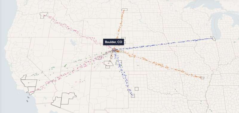
Now, a new interactive map developed by researchers at CU Boulder and The Plotline, a food climate initiative from the nonprofit organization Earth Genome, sets out to answer that question. It's called Food Twin, a "digital twin" of the country's sprawling and potentially fragile food system.
With Food Twin, users can look up their home county to see how much of 25 critical food crops their local regions both produce and consume. Those food staples include everything from wheat to tomatoes and peanuts, grown both in the U.S. and overseas. The map similarly tracks the flow of food across the country, following highways from sites like Kern County, California, to Denver, Chicago and beyond.
Food Twin also shows just how precarious that network might be, said Zia Mehrabi, a data scientist at CU Boulder who helped to spearhead the new tool. The map presents what he calls a "farm to fork" view of how increasingly severe droughts and heat waves may affect the nation's food supply.
The United States depends on a little more than 5% of its counties to produce half of the crops consumers eat.
"It's risky," said Mehrabi, assistant professor in the Department of Environmental Studies. "It really raises the question of whether the sources of food for many locations are as diverse as they should be."
Food Twin draws on a heaping plateful of data—bringing together for the first time information ranging from satellite images of farmland to food availability surveys, census statistics, logistics computer models and more.
In Colorado, for example, Boulder County relies on locations like Adams County, Colorado, and Hockley County, Texas for its crops. New York, in contrast, depends on Putnam and Seneca counties in Ohio and imports via Renville County, North Dakota, and more.
Mehrabi, who has spent years studying crop production around the world, said that the map makes him see food in a different way.
"It's one thing to have these conversations and hear anecdotes about how climate change is impacting food systems through cascading impacts down supply chains," Mehrabi said. "It's another thing to see that data right in front of you. It really hits home."
Protecting your food
He and his colleagues launched Food Twin just ahead of the 2023 United Nations Climate Change Conference, or COP28, in Dubai.
The world's food, Mehrabi noted, faces an uncertain future in the decades to come. According to the U.S. Global Change Research Program, the number of heat waves affecting the country's largest cities has doubled since the 1980s. Droughts and wildfires are also on the rise—and all of that can take a bite out of the nation's food supply.
Kern County, for example, is a monster of agriculture, producing nearly 600 billion calories' worth of crops every year, according to the tool. In the coming decades, however, a single extreme heat wave could wither that production by as much as 8% or more.
On the consumer side in Boulder, a single severe drought in the U.S. might reduce the supply of crops coming into the county by 2.5% That amounts to more than 2.4 billion calories lost.
But there's a lot that consumers and leaders in the U.S. can do today to shore up the nation's food supplies, Mehrabi said—from taking action to combat climate change to diversifying the supply chains feeding local communities.
He and his colleagues at Earth Genome are already working to expand Food Twin to the entire globe. He hopes people will use the tool to make pro-active plans for increasing the world's resilience under climate change.
"I think Food Twin can be useful for not just knowing where your breakfast comes from," Mehrabi said, "but also for changing the conversations we're having about food."
Provided by University of Colorado at Boulder


