Sentiment in New York City: A high resolution spatial and temporal view

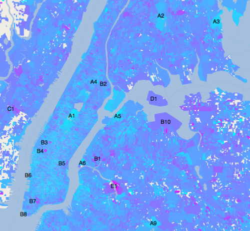
Imagine having your finger on the pulse of an entire city, in real time. To see its heartbeat—changes in people opinions and moods—as a cascade of color, sweeping over the terrain. Researchers at the New England Complex Systems Institute (NECSI) used the explosion of data from Twitter to take snapshots of the mood of New York City, and follow its ups and downs in real time and high resolution.
They discovered that there are clear patterns in the fluctuations of Twitter users' feelings. On the whole, tweets are most positive near public parks like Central Park and the New York Botanical Garden, and most negative around transportation hubs such as the entrance to the Midtown Tunnel and the Brooklyn Bridge, Penn Station and Port Authority, and the two airports: JFK and LaGuardia.
People closer to Times Square are happiest and the mood generally worsens the further away you go. Within each day, sentiment peaks at midnight, and dips between 9am-12pm. The analysis was able to use precise data about the time and location of the tweets in order to create an accurate map and see fine grained patterns.
The report, "Sentiment in New York City: A High Resolution Spatial and Temporal View," by Karla Bertrand, Maya Bialik, Kawandeep Virdee, Andreas Gros and Yaneer Bar-Yam, created an algorithm to automatically classify tweets as positive or negative, and use their geotags and time information to paint a map. The algorithm started with emoticons like :) and :(, and by looking at other features of those tweets, learned to identify sentiment even in tweets that relied on words to express emotions.
Due to the great detail in the analysis, the researchers were able to locate specific areas of extreme sentiment such as cemeteries and medical centers. One area, Maspeth Creek, that has extremely negative tweets coming from it, they discovered has a foul smell not only because of the gaseous mudflats, but also because it is the site of the largest oil spill in the country and receives 288 million gallons of untreated sewage each year.
While previous reports have speculated on the effect of surroundings on people's quality of life, the new analysis shows very clearly that people are upset by an odorous creek, traffic, and trains, buses, and airplanes running late, and happiest in public parks.
"This is the first time we are able to easily and precisely map people's mood to their time and location" said Bar-Yam. "The possible uses of this tool are endless."
More information: Bertrand, K. et al. Sentiment in New York City: A High Resolution Spatial and Temporal View. NECSI Report 2013-08-01 (08/20/2013). necsi.edu/research/social/newy … newyorksentiment.pdf
Provided by New England Complex Systems Institute


