Review: HTC One's interface sullies a great-looking phone
HTC's new One is a smartphone I like to hold but don't like to use. I love its design and some of its top features. But I found other key features disappointing, including the One's revamped interface, which is a confusing mess.
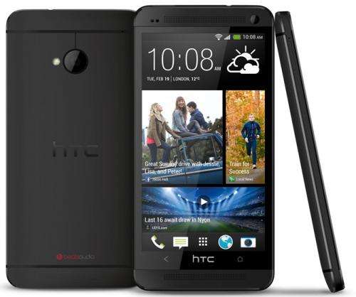
That's unfortunate because the gadget is one of the sleekest, best-designed smartphones I've seen. The One's case is carved out of single piece of aluminum. That gives it a solid, durable feel and makes its archrival, the plastic-encased Samsung Galaxy S4, feel cheap by comparison.
Although the One is slightly thicker and heavier than the Galaxy S4, it feels better in the hand because of its rounded back, tapered edges, and narrower case and screen. You can type one-handed on the One, something that those without jumbo mitts will have a hard time doing on the Galaxy S4.
Another thing that makes the One stand out is its sound. The device incorporates a pair of stereo speakers, one above and one below its display. Those speakers aren't going to replace a high-quality stereo system, but they produce enough sound to fill a small room and make the speakers in other smartphones sound tinny.
Like the Galaxy S4, the One offers a collection of new features in its camera application. Users can create action shots that combine multiple images of a person into one picture, can remove people or objects who inadvertently show up in the background of an image, and can swap out people's faces in a picture to ensure that everyone in the image is smiling and has their eyes open.
But on the Galaxy S4, you have to choose - before taking the picture - the feature you want to use by selecting a particular shooting mode. By contrast, the One gives you access to all these features after taking the picture, meaning you don't have to know in advance which feature you want to use.
Unfortunately, other aspects of the One are much less satisfying and are at times even grating.
The worst aspect of the phone is a new interface called BlinkFeed, which is a virtual collage of constantly updated, tappable picture tiles. The photographs, which typically are overlaid with short descriptions, are pulled from news, social networking and other websites and link to stories, posts and photo galleries. Users can choose to view tiles from just one source or pertaining to just one subject or customize BlinkFeed to show tiles from a collection of different places.
But the tiles are a jumble arranged in an endless scroll. And because they generally don't link to apps, the tiles distract from and get in the way of accessing other applications.
Unfortunately, HTC doesn't allow you to remove BlinkFeed. Even if you turn off its updates and change your default home screen, BlinkFeed will still linger, taking up space as one of your home screen panels.
I also found the One's camera disappointing, despite its cool features. The rear camera only has 4 megapixels, compared to 13 on the Galaxy S4. HTC has argued this difference is actually an advantage because the size of the pixels are much larger on the One, which should yield sharper pictures and allow it to shoot better in low light. But in my limited tests, I didn't see much of an advantage. Compared with pictures taken with the 8-megapixel camera on my iPhone 5, the One's pictures were just as grainy when enlarged, and the colors were much more washed out.
Other things to note about the One are that it doesn't come with the latest version of Android and you can't remove its back to swap out its battery or to increase its storage capacity. I wasn't troubled by these limitations because the battery lasted a full day in my tests and the 32 gigabytes' worth of storage on the base model is sufficient for most users. But for some Android fans, such shortcomings may be deal-breakers.
It's too bad the One's interface and some of its other features aren't as excellent as its physical design. If they were, it would be a phone you wouldn't want to put down.
HTC ONE SMARTPHONE:
-Troy's rating: 6.5 (out of 10)
-Likes: Solid feeling aluminum case. Narrow, rounded design allows one-handed use. Sharp screen. Loud, rich-sounding stereo speakers. Camera app allows users to create action shots, remove unwanted objects without having to preselect a particular shooting mode.
-Dislikes: New tile-based interface is a distracting jumble. Pictures are washed out and noisy when enlarged. Doesn't include latest version of Android. Battery not replaceable.
-Specs: 1.7 GHz quad-core processor; 1920x1080, 468 ppi display; 2 megapixel front and 4 megapixel rear cameras.
-Price: For 32 GB model, $200 with two-year contract with AT&T; $100 with two-year contract at Sprint for new customers; $100 with two-year payment plan with T-Mobile. For 64 GB model, $300 with two-year contract on AT&T.
-Web: htc.com
©2013 San Jose Mercury News (San Jose, Calif.)
Distributed by MCT Information Services


