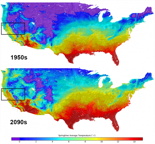
New US climate map shows temperature changes in HD

If you're interested to see how warm your neighborhood will look like at 2090, here's a chance. There's new data available that has monthly climate projections for the continental United States at the size of a neighborhood, or about a half-mile (800 meters).
Readers who have moderate to advanced knowledge of how to manipulate datasets can see instructions for how to get the raw information here. As for everyone else, NASA briefly summarized how the information could be used for community planners to deal with the effects of climate change.
The map charts how rain and temperatures in the United States will be affected based on greenhouse gases. Because, of course, this is a projection, the researchers ran four different scenarios for the period between 1950 and 2099. Climate projections came from global climate models from the upcoming Inter-Governmental Panel on Climate Change 5th Assessment Report and historical surface observations.
The projections "may make it easier for resource managers to quantify anticipated climate change impacts on a wide range of conditions and resources important to local communities," NASA stated.

The agency then provided a long list of research areas that would benefit, including "water supplies and winter snow packs, public health and the spread of insect-borne diseases, flood risk and potential impacts to critical urban infrastructure, wildfire frequency and severity, agricultural production, and wildlife and biodiversity."
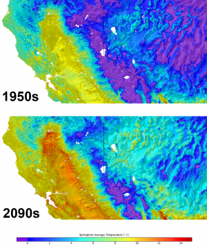
As you can see from the climate map above, Nevada and California are highly affected by the projections, and officials in the region are paying attention, according to NASA.
"We are using the 800-meter downscaled datasets for conservation planning and resource management in the San Francisco Bay Area," stated Stuart Weiss, a researcher at the Terrestrial Biodiversity Climate Change Collaborative in the San Francisco Bay Area.
"They provide an indispensable, if necessarily hazy, crystal ball into hydrological and ecological responses through the 21st century. It will be a very useful tool for climate change planning and adaptation that will be exported to the remainder of California and eventually the western United States."
The data was crunched using supercomputers at NASA's Ames Research Center, allowing the team to "produce the downscaled, high resolution climate dataset for the U.S. within months of release of the final global climate scenarios prepared for the next IPCC assessment report," NASA added.
Source: Universe Today


