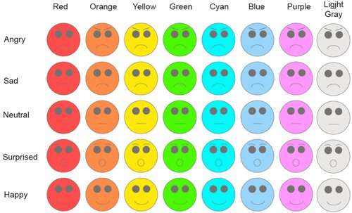
Credit: Liverpool Hope University
Social media networks need to introduce more colors for their emoticon graphics to stop users "misleading" each other, a specialist has warned. The claims stems from new research by experts from Liverpool Hope University, UK, and Joshibi University of Art and Design, Tokyo, Japan.
Emoticons are traditionally rendered in yellow—after American commercial designer Harvey Ball created his "smiley" as a distinctive yellow button back in 1969. But a new study has revealed how an emoticon's color might affect the emotional, or nonverbal, impact of the message.
Researchers found cheerful "smileys" were perceived as "happier" when rendered in yellow or orange, while "angry" emoticons conveyed stronger emotion when presented in red. "Sad" emoticons were "sadder" when rendered in blue or "cyan" turquoise, and "neutral" emoticons came across best when rendered in gray.
But, on the flip side, "angry" emoticons rendered in cool colors—and "sad" and "neutral" emoticons in warm colors—revealed higher chances of being misinterpreted.
The results have been published in the journal i-Perception.
Lead author Professor Galina Paramei, of Liverpool Hope University's Department of Psychology, warns about the risk of "misinterpretation of the context, the tone of the message, or the sender's attitude—be it a negative bias, flaming the interaction, or a positive bias with spurious peace-making—but ultimately impacting the efficiency of communication."
And she adds: "The present findings can be useful in developing communication tools in social networking sites to improve the 'emotion catch-ball' in digital communications by using emoticons with congruent color variations instead of conventional yellow emoticons."
Prof Paramei and her research colleagues, Ph.D. student Songyang Liao at Kanagawa University and Professor Katsuaki Sakata at Joshibi University, in Japan, suggest the phenomenon could be related to how humans are hardwired to perceive the color of expressed emotions in real human faces—aka "biologically engrained face coloration."
Prof Paramei, a respected color vision scientist, explains: "Specifically, approach-oriented emotions—anger, happiness, surprise—evoked by challenge elicit vasodilation, facilitate blood flow to skin areas, with the face becoming redder and yellower.
"Conversely, avoidance-oriented emotions, such as disgust, fear, sadness and triggered by threat, elicit vasoconstriction, reduce blood flow to the face and, hence, incur bluer or greener facial coloration."
The new research saw Prof Paramei and her colleagues putting around 50 participants based in Japan through a series of four laboratory-based experiments and one online experiment. The volunteers ranged in age from 18 to 23 years old and were both male and female.
Each test centered on a set of 40 different emoticons representing four basic emotions—"Angry," "Sad," "Surprised," and "Happy," and a "Neutral" expression, which were each rendered in eight different colors, running from red through to orange, yellow, green, cyan, blue, purple and light gray.
The bulk of experiments in the series saw participants assessing the affective meaning of different colored emoticons before deciding whether the image was "Not Angry or Angry," "Not Sad or Sad," "Not Neutral or Neutral," "Not Surprised or Surprised" and "Not Happy or Happy."
The results were more or less consistent throughout both the lab and the online experiments.
Prof Paramei says: "As is apparent, "angry" emoticon was perceived as "angrier" in warm colors, particularly in red and orange.
"Red 'angry' emoticon had higher angry affective meaning than in all other colors, and orange 'angry' emoticon was 'angrier' than in light gray.
"'Happy' emoticon, as expected, was judged 'happiest' in yellow: the corresponding affective meaning was higher than when it was rendered in purple and light gray or red, cyan, and blue. 'Happy' emoticon was also judged rather 'happy' in orange, with happy affective meaning higher than when it was rendered in cyan, blue, purple, or light gray. In green, happy affective meaning was greater than in light gray.
"Conversely, 'sad' emoticon was perceived as 'sadder' in cool colors, cyan and blue; in both colors, sad affective meaning was higher than when it was rendered in red, orange, yellow, or green.
"It is worth noting that purple 'sad' emoticon evinced a sad affective meaning estimate that was only marginally lower than when rendered in either cyan or blue.
"'Neutral' emoticon was judged as most 'neutral' in light gray, with the corresponding affective meaning significantly higher than in red, orange, or yellow.
"Finally, 'surprised' emoticon appeared to slightly better-convey the intended emotion when rendered in red, higher than in blue, in accord with findings for realistic face images."
For the Japanese respondents, Professor Paramei and her colleagues found that, on average, the color of the emoticon accounted for a third of the meaning of the emotion attributed to it.
More information: Songyang Liao et al, Color Affects Recognition of Emoticon Expressions, i-Perception (2022). DOI: 10.1177/20416695221080778
Provided by Liverpool Hope University


