Researcher explores what causes maps to go viral on the web

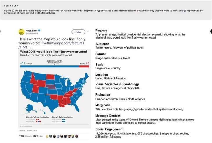
As the 2016 presidential election was heating up, the statistical news website FiveThirtyEight released a projection map suggesting the distribution of votes if only women voted.
The map, sent out in a tweet by FiveThirtyEight founder Nate Silver, quickly went viral on social media and was viewed millions of times. That viral cartography event, and what quickly followed, is the subject of research conducted by Anthony Robinson, assistant professor of geography at Penn State.
The map spawned a series of copycat maps, many of which also went viral. They range from serious offshoots along racial lines, "What if Only People of Color Voted," to silly, "What if Only Goats Voted," to the hard-to-verify, "What if Only Taxpayers Voted."
In Cartography and Geographic Information Science, Robinson lays out a framework for beginning to understand what a viral map is, how we can define it, how we can verify its origin and data, and how we can learn from it. Robinson proposes looking at criteria such as a map's purpose, audience, content, social engagement and visual variables, and uses machine learning to automate the process of analyzing the contents and potential origins of viral maps and the maps they have inspired.
Robinson collected about 500 different maps that spawned from the FiveThirtyEight map and used Google Cloud Vision to analyze their details, which gave him insights into their design and the ways in which they were shared.
"I started seeing patterns. Some of them are totally satirical, but others were more serious responses, such as here's what if only people of color voted, what if people under the age of 18 voted. There were many derivations," Robinson said. "We know so little about this process. It was interesting to see this viral seed cause these viral explosions."
Robinson is interested in how maps are used because maps convey a level of accuracy, even when many of these shared maps bore none of the scientific validity of the original work. Take the "What if Only Taxpayers Voted" map, for instance.
"That map would be hard to do accurately," Robinson said. "You would need to pull together a lot of different sources and even then the linkages between voting and tax data would be problematic. I would put that task beyond the scope of the usual Twitter user. Instead it looks like it's just been lifted from an existing map and a new title was slapped on it. It's worrisome because that map conveys more validity than it map deserves. It becomes quite easy today to create your own reality, your own truth."
In an era of "fake news" generation, Robinson said it's important to understand where these maps originate. Charting the path a map takes to becoming viral could lend clues as to its authenticity. If a map gains traction, steadily increasing in shares until it goes viral, that may follow an organic path. But if it systematically shared on dozens of sites simultaneously, that suggest bots may be at play.
"I suspect there may already be bot-generated maps on the internet," Robinson said. "Maps can be used to sway public opinion on issues in a way that's more powerful than discussion alone, and we know for sure that there are plenty of social media bots engaging in conversation with people who don't even know they're talking to a bot."
Understanding what causes a map to go viral can also help cartographers make better maps. Robinson wants to know what elements of the map resonate with human emotion so that cartographers can capitalize on these elements to better tell their stories.
"Issues such as infant mortality, food security, and malaria are just a few of the many stories that can be told through the use of maps. By understanding the power of maps to resonate with a mass audience in viral social media, we can make maps that make a difference."
"We need to be better at understanding the connections people make with maps and this research gets us closer to that," Robinson said. "Their mechanisms for storytelling are so powerful and emotionally connective, and we need to understand how they work in a time in which they can be created by anyone and shared with anyone at any time."
More information: Anthony C. Robinson. Elements of viral cartography, Cartography and Geographic Information Science (2018). DOI: 10.1080/15230406.2018.1484304
Provided by Pennsylvania State University


