April 22, 2011 report
Google Earth maps show populations at risk near nuclear plants

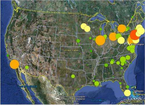
(PhysOrg.com) -- In a novel use of existing technology and data, Nature News in conjunction with Columbia University, has created a Google Earth map that shows the different population sizes surrounding nuclear power plants; ostensibly, to demonstrate the danger threshold of other plants worldwide, compared to the ongoing nuclear disaster at the Fukushima Daiichi plant in Japan.
Working with the Power Reactor Information System (PRIS) database run by the International Atomic Energy Agency (IAEA) to pinpoint the location and size of nuclear plants, both existing and under construction, and Columbia University’s NASA Socioeconomic Data and Applications Center, which runs the Global Rural-Urban Mapping Project, to nail down accurate population numbers, the team was able to put together a Google Earth map that very clearly shows, via colored circles, population density around nuclear facilities.
Because Google Earth maps render the globe in a 3-D like image, it’s easy to skim around and very quickly get a feeling for where the dangers lie. For example, the United States, Europe (including Russia and former members of the USSR), India and China quite obviously have the bulk of nuclear plants, while the entire continents of Africa and South America have just one each, and Australia has none.
And because circle size and color are used to represent population density (number of people living within 75 km [about 47 miles] of a nuclear plant), it’s also easy to see with just a glance how many people live in areas that would be at risk should a nuclear accident occur in that area.
What stands out is how big the numbers are for some areas; for example, the Guandong plant in China (near Hong Kong) has over twenty eight million people living within 75 kilometers of the 1888 MW plant, which has two reactors. Clicking on one of the circles brings up more details, for example, at the Guandong plant, an astonishing three and a quarter million people live within a 30 km radius; all of whom would likely suffer some rather serious repercussions if the plant were to have an accident on the scale of the Fukushima disaster.
Of course, what’s not shown in these maps are confidence measures to show how safe the plants actually are, which even if they did exist, would be based on assumptions and suppositions, likely created by the very same people that were operating them; not exactly a situation that would warm the heart. And while the Google Earth maps created by Nature News and Columbia University certainly are eye opening, it does make you wonder if in the end, it’s not just another case of a study generating shock value without creating anything of actual use; after all, is it likely that any of the plants will be moved simply because now everyone knows how many people live around them?
More information: Reactors, residents and risk, Published online 21 April 2011. Nature doi:10.1038/472400a
© 2010 PhysOrg.com


