Revealing glacier flow with animated satellite images

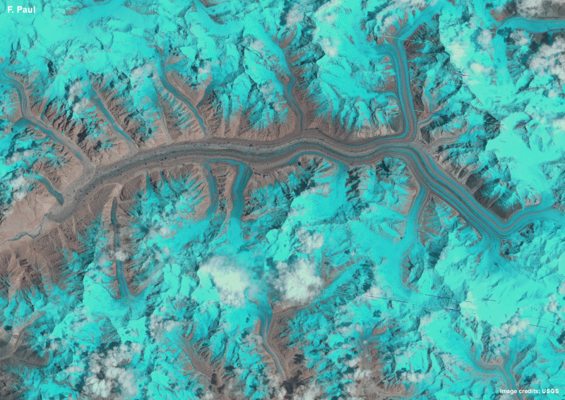
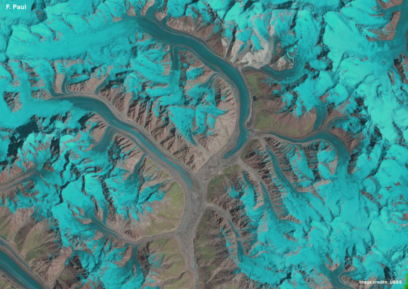
Frank Paul, a glaciologist at the University of Zurich in Switzerland, has created animations from satellite images of the Karakoram mountain range in Asia to show how its glaciers flow and change. The images of four different regions compress 25 years of glacier changes into just one second, revealing the complex glacier behaviour in the Karakoram. The animations are published today (26 November) in The Cryosphere, an open access journal of the European Geosciences Union (EGU).
The new animations reveal glacier flow and changes over a much longer time period and at a much larger scale than ever before, using the Karakoram as an example. While time-lapse movies made using daily photographs taken with cameras stationed at glacier fronts are available for some glaciers, they only show changes over a few days to a few years and for a small part of a glacier. The animations now created with satellite images provide a whole new look at glacier dynamics.
The animations use images acquired from 1990 to 2015 by three different Landsat satellites, operated by the US Geological Survey (USGS) and NASA. Twenty five years of relatively slow glacier change are compressed into one second, meaning glacier movement is sped up some 800 million times. "The most interesting insight is to really see how the glaciers flow and how the individual parts of the glaciers, such as the tributary streams, interact," says Paul.
Paul produced the image sequences for four regions - Baltoro, Panmah, Skamri-Sarpo Laggo, and Shaksgam - in the central Karakoram. This mountain range is home to some of the highest peaks in the world, including the famous K2, and glaciers of varying sizes cover much of the steep and high terrain. They show complex behaviour: most of them are not retreating, unlike in other regions in the world, but are advancing or surging (with speeds up to 100 times faster than normal at times) and flowing into each other.

"From a scientific point of view, the key motivation for this research was to understand the highly variable behaviour of the glaciers in the Karakoram. We have known about this for over 50 years, but still have a very limited scientific understanding of what is going on there. The animations are a very practical way to get a better overview and follow the changes through time."
The time-lapse view makes it easier for the human eye to follow glacier flow and detect changes. The Baltoro animation, for example, highlights how fast and steadily the glacier is flowing without changing the position of its front, while the Panmah image sequence shows several surging glaciers flowing into each other.
These changes would be hard to observe by other methods, such as by comparing side-by-side images of a glacier taken at different times. "The side-by-side comparison is a very tedious thing as the brain cannot freeze-frame and virtually overlay the images," Paul explains. "This inability is classically played with in the 'Find the ten errors' images shown in the game corner of many magazines."
As detailed in The Cryosphere, Paul created the animations in simple gif format using satellite images freely available for download from the USGS website. For each animated gif, he used 7 to 15 false-colour satellite images, with glaciers shown in light blue to cyan, clouds in white, water in dark blue, vegetation in green and bare terrain in pink to brown. Paul then used free software to create a looping animated gif (showing each frame for 0.1 seconds) for each of the four Karakoram regions.
"I like the idea of applying an 'old-school' and very simple file format, along with freely available software, to do something that is difficult to achieve with other formats or commercial software," Paul says. The gif image format, which only supports 256 colours, is popular on the Internet, and this study shows it has potential in glaciological research as well.
Paul believes that animated satellite images could also find use as educational tools, helping the wider public understand glacier dynamics. "But most importantly, anybody can create these animations," he states. "Everything required to do it - both images and software - is freely available, so I recommend trying this at home."
More information: This research is presented in the paper 'Revealing glacier flow and surge dynamics from animated satellite image sequences: examples from the Karakoram' to appear in the EGU open access journal The Cryosphere on 26 November 2015.
The scientific article is available online, free of charge, from the publication date onwards, at www.the-cryosphere.net/recent_papers.html
Journal information: The Cryosphere
Provided by European Geosciences Union


