Mapping the connections between diverse sets of data

What is a map? Most often, it's a visual tool used to demonstrate the relationship between multiple places in geographic space. They're useful because you can look at one and very quickly pick up on the general outlines of a place—California is close to Arizona and Oregon, but those latter two aren't very close to one another. That's easy to understand visually, but much harder to understand if you just had a list of which states bordered one another.
Maps don't have to be strictly geographic. A map can also depict ideas, and the visual nature of such a map can allow its viewers to quickly understand how its ideas relate to one another. That is the concept behind San Diego State University's new Center for Information Convergence and Strategy.
The center is a partnership between several SDSU geography professors and researchers with a passion for information technology. Co-director Akshay Pottathil, an adjunct geography professor, said the project was inspired by an interesting wrinkle in the nascent field of data science: "Big Data," as it's known, doesn't just have loads and loads of data—it has a lot of different kinds of data.
Unstructured data
Pottathil refers to these as "unstructured texts and other knowledge artifacts," which in plainer language means that the data aren't necessarily mutually formatted. They come from a wide array of sources: journal articles, newspaper articles, interview transcripts, book chapters, blog posts, etc. The sheer variety of these data inputs makes it difficult for traditional modes of data analysis to make sense of how they relate to one another.
"There's a huge need for understanding heterogeneous data using new media," Pottathil said. "We need to know how to make sense of very diverse data."
The researchers' solution to deciphering important relationships among all this heterogeneity is to map the data. In some cases that produces a literal geographical map, for instance by mapping GPS data from various mobile devices at different times of the day and during different days of the week. This would be important to emergency responders who might need to know where best to direct resources in the case of a natural disaster.
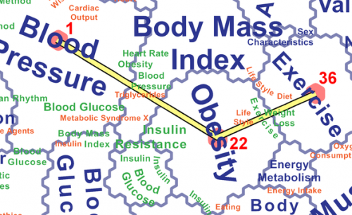
Other times, the maps produced by CICS use distance and borders as metaphors for the relatedness of ideas. One example of this is a map the researchers created by feeding into an algorithm more than 2 million medical journal articles published over a five-year span. Their algorithm identified similarities in word choice and other semantic content, and then formed a map showing how closely the ideas in biomedical science are to one another.
"At a glance, you can see that when people talk about obesity, they're also talking about exercise, blood pressure, insulin, aging, heart rate," said geography professor and co-director André Skupin. "And from there you can see how those ideas also border public policy issues such as school lunches."
Getting up to speed
The value, Pottathil and Skupin said, is in the ability to look at one of these maps and very quickly come to a broad understanding of the topics associated with your area of interest. If you're a researcher looking to collaborate in a new field, for example, you could look at an idea map to quickly familiarize yourself with the issues, then zoom into particular areas of the map for finer and finer details until you finally arrive at a handful of articles specific to your interest.
"How do you read a million papers?" Skupin said. "You can't. But this gives you a quick topographic overview of a new field."
The center will serve as a resource for researchers at SDSU as well as those in the community interested in harnessing the power of their datasets. People interested in collaborating with CICS can contact them via its website.
Government agencies and public interest groups are also intrigued by the possibilities presented by this technology. At the CICS inauguration in August, Congressman Scott Peters lauded the center's ability to use massive amounts of data to tackle societal issues.
Pottathil and Skupin said that law enforcement agencies could use these maps to better understand crime trends; public health officials could monitor disease outbreaks; hiring firms could match up the skills possessed by returning veterans with job openings.
"Here we have information converging," Pottathil said, "and the end result is strategy."
Provided by South Dakota State University


